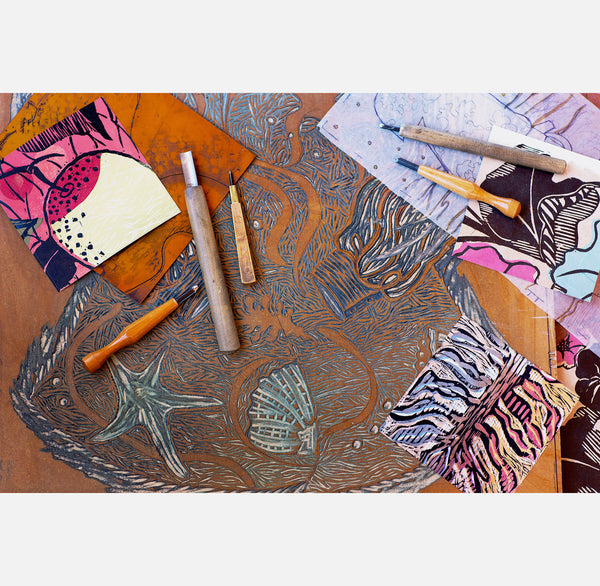
What is Printmaking?
Printmaking has been an art form since the 15th century! It’s a vast array of possible processes that artists engage in and has been a European as well as Asian tradition for hundreds of years. In essence, it is the making of an image or a block of text onto a matrix such as wood, metal, or stone that is then transferred to a piece of paper through the pressure of a printing press or the artisan’s hand tool. Because the matrix is sturdy, there is the ability to create multiple impressions on multiple sheets of paper which thus forms an ‘edition’.

Relief
I will share here some information about the processes I use in my own printmaking. I engage mostly in what is called ‘relief’ printmaking. This means that I use tools such as chisels to carve an image onto a substrate such as a wooden board or a sheet of artists’ linoleum. After carving away the negative space of the drawing, the block or plate is left with the positive areas of the image in ‘relief’ or standing at level. The block is then inked with a brayer or roller and then put through a press with a piece of acid free paper on its surface, to imprint the image onto the paper. By creating two or more plates or blocks, one can ink each in a different color and over-print onto the same paper creating a more dynamic and multi colored image.
Chine collé
A process I love and use often is chine collé. What is it? In a nutshell, it is the use of very light papers, mostly from Asia or other 3rd world countries that have traditions of handmade plant fiber papers. It originated in Bavaria in the mid 19th century. A fine lightweight paper was used to print lithographic images on and then this finer sheet of paper was adhered or collaged to the base sheet. The European printers preferred Chinese papers that were coming into Europe via the Silk route and thus this adhering of Chinese printed papers to heavier European paper was referred to as ‘chine collé’ or Chinese collage.
In my process, these papers are cut to shapes/patterns that match the open shapes of my relief print design. I then use a wheat paste glue called Nori to brush lightly on the back of each shaped paper and then, through the pressure of the press, these paper shapes are attached to the surface of the base sheet of heavier (European), dampened paper. After these artworks go through the press the sheet is dried, flattened and then the designed and carved relief block or plate is inked and carefully printed over the pattern of pasted Asian papers.
It’s an arduous process with a lot of casualties along the way. I often say that no one in their right mind would do this special and tedious technique but I have labored the kinks out of it (more or less) and I really enjoy the final image that comes from the effort.

Reduction Woodcut
Reduction woodcut is a process that I use with all of my Womenswear prints: cowgirl shirts, kimono forms and fantasy garments. I also love this process for what it offers.
It starts with a good scale drawing which I transfer onto a wood plate (often MDF, medium density fiberboard) . I select a number of sheets of properly torn Japanese paper to print an ‘all at once’ edition. The first colors printed are the light ones. Then, the block is ‘reduced’ or carved away in each area where the light colors are to be preserved on the image/paper. Each color area is then inked and printed and then carved away, going from light to dark. I am never quite sure of whether I have it right, and can only proceed rather intuitively, on one step, one color ink at a time. In the end, the print speaks to me and says that it is complete and then, with my edition stacked on the table, I scratch my head and decide whether it is a success or not. The element of not knowing for sure, and the numerous passes on the press are nerve wracking but somehow enjoyable.
ouidatouchon@gmail.com / ph: 575-635-7899
